Link Bridge
Legal Task Management Platform for Zeitgesit group.
Designed and led a centralized task management platform for a legal consulting firm to replace fragmented spreadsheets and email workflows. The product focused on clear ownership, reliable status tracking, and simple defaults to reduce coordination loss across teams.
%2012_13_46%E2%80%AFp_m_.png)
%2012_38_58%E2%80%AFp_m_.png)
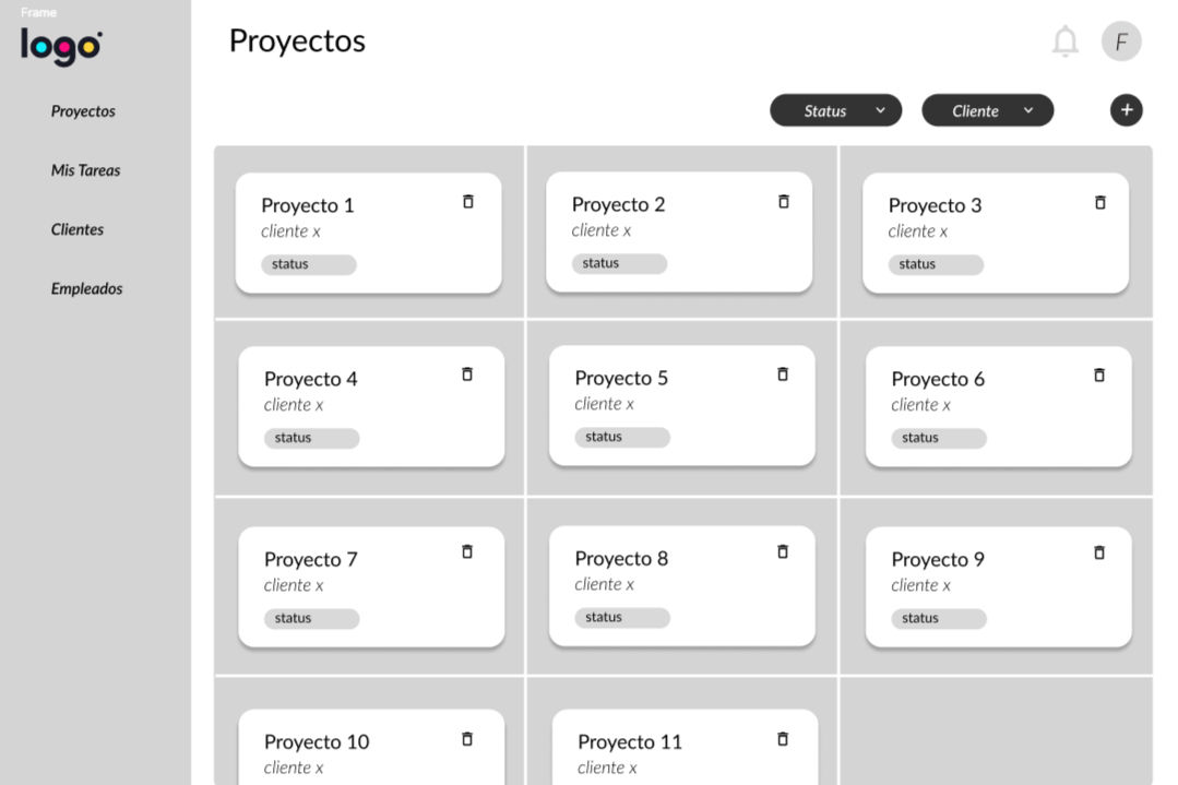
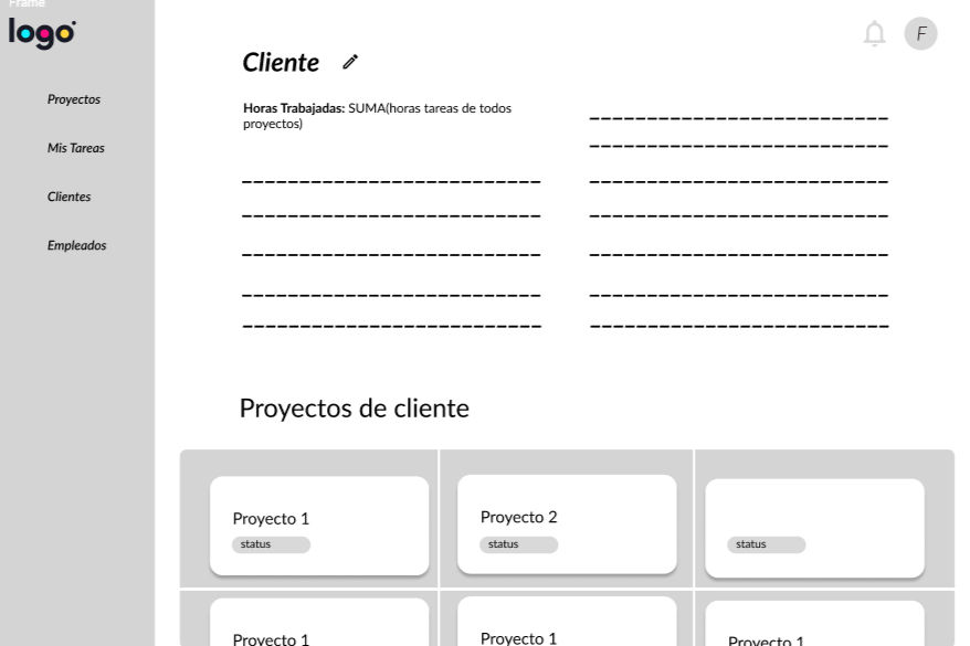
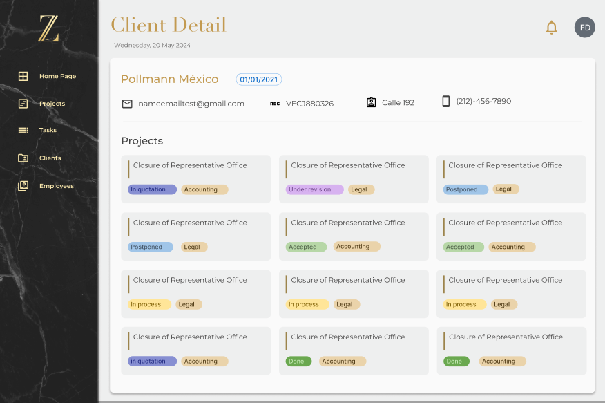
PROBLEM
Teams in the legal consultancy were managing projects with confusing spreadsheets and email. This led to forgotten action items, duplicated work, and poor visibility on task status, costing billable hours and delaying deliverables.
GOAL
Build a centralized project-management system that reduces manual coordination time by 30% and increases the number of projects the firm can take on by +1 per semester. Outcome: We achieved a 48% reduction in manual work time.
my role.
Product Owner & UX/UI Designer (light front-end)
tools.
Figma · Google Sheets · Discord
IMPACT
-
– 48% manual coordination time on core tasks (goal was –30%).
-
Capacity: leadership reported being able to take on +1 project per semester thanks to fewer coordination losses.
-
Quality: fewer “Who owns this?” follow-ups; clearer audit trail (activity timeline).
What I learned
-
Clarity beats feature bloat: one unambiguous Owner field solved more problems than adding configurations.
-
Feedback is a trust contract: confirmations and visible state changes reduce re-checking.
-
Start with the busiest path: optimizing capture/update flows delivered great impact.
FIRST DRAFTS
wireframes.
Started with a whiteboard so everyone (legal, ops, tech) could see the same picture.
Drew the main steps and the tricky cases and agreed on one place that holds the latest info for task, status, and owner.
Result: a short list of key flows and clear success criteria we all aligned on.


Messy, unreliable spreadsheets
pain point
Information lived in multiple sheets with inconsistent columns and duplicates. People weren’t sure which file had the latest truth.
No continuity / unclear handoffs
pain point
After someone finished a task, it wasn’t clear who should act next or if the task was really “done.” This caused pings, delays, and rework.
Confusing expense workflow
pain point
Fields and steps were unclear; attachments and approvals were hard to track. Many users postponed logging expenses or did it incorrectly.
low-fi.
Made low-fi screens to test structure, not visuals. Checked three things: can people find the right action, do they know the next step, and do they see that changes are saved? Updated the screens, and kept a simple, formal tone for a legal team.
Result: a small set of interaction rules and a clear backlog for the first release.


I ran a mix of methods: interviews with stakeholders, watched how they actually worked with spreadsheets and email, and ran usability tests on low-fi screens. At first, I thought users needed more features. The research showed the real issues were unclear ownership and next steps, and not knowing if changes were saved or statuses updated. So we focused on clarity, simple defaults, and clear confirmations instead of adding lots of settings.
methodology.
Format: in-person, moderated, think-aloud
Rounds: MVP (first pass), MBI-1 (after fixes)
Measures: task success/fail, short notes on errors
findings.
Hard-to-find actions (14 notes)
key actions like log expense / attach sat in overflow menus.
Weak save/status feedback (16 notes) people weren’t sure changes were saved or what the current status was.
Date/calendar confusion (6 notes)
users tried clicking the calendar but didn’t see the right control.
numbres.
All sessions:
102 task attempts → 88 success / 14 fail (86%).
MVP only:
73 task attempts → 59 success / 14 fail (81%).
After fixes (MBI-1):
29 task attempts → 29 success / 0 fail (100%).
changes.
Promoted primary actions to a fixed action row (no hidden ellipses for core tasks).
Added clear confirmations (toast) for saves and status updates.
Simplified the date edit control and made it visible in the task details.
USABILITY STUDY
DESIGN
color palette.
We followed the brand guidelines: a neutral, formal palette.
The aim was to convey credibility appropriate for legal workflows, maintain contrast, and avoid visually noisy UIs that increase cognitive load.


USER RESEARCH

"If I can’t see who owns it and what changed, I’ll ping people anyway.”
goals:
-
Have one source of truth for tasks, owners, and deadlines.
-
Capture tasks/expenses fast during calls.
-
Keep weekly updates to partners accurate and on time.
-
Reduce follow-ups and back-and-forth.
frustrations:
-
Duplicate entries and unclear task status.
-
Key actions (attach file, log expense) are hard to find.
-
No clear save/status feedback, so she rechecks work.
-
Time lost building manual reports.
Mariana Rios
Age: 32
Education: B.A. in Business Administration
Hometown: Querétaro
Family: Lives with partner
Occupation: Operations Coordinator, legal consultancy
Mariana coordinates 8–12 active matters. She takes notes during client calls, then updates tools at day’s end. Because information is scattered, she spends extra time asking who owns tasks and whether changes were saved. She needs a simple, trustworthy system to assign work, track status, and share clean weekly updates without manual fixing.
Responsibilities
-
Led all client meetings: discovery, weekly check-ins, demos.
-
Prioritized the roadmap with stakeholders; kept the backlog up to date; wrote user stories and acceptance criteria.
-
Planned and ran user research: stakeholder interviews and moderated think-aloud usability tests.
-
Turned findings into whiteboard flows, low-fi wireframes, and Figma hi-fi prototypes.
-
Worked daily with devs to scope sprints, do handoffs, and support QA.
-
Implemented small front-end tweaks (copy, layout, states) to speed up delivery.